This article breaks down the must-have colour theory for beginners.

Colours are one of the fundamentals when it comes to art basics. As an aspiring self-taught artist, I understand the importance of mastering our basics. Understanding colour theory and the colour wheel is the first step.
You will learn all colour theory for beginners including colour psychology, colour and its application, colour harmony wheel, colour wheel history, and many more.
This post is everything about colour theory for beginners who love colours.
Colour Psychology
Colours are not just pigments; they are emotions on canvas. Colour Psychology is the art of understanding how colours hold the power to influence our emotions. Each colour can make you feel joy, sadness, excitement, or calmness – it Is a language that transcends words. Here is a simple breakdown of the moods associated with each colours (see image).
But why is this important for artists and anyone exploring colours?
Because understanding how colours affect our feelings and those of our viewers is like having a secret tool that helps us convey the exact message through our art.

Importance of Colour Theory
As mentioned in the section on colour psychology, where we explored how colours can influence our emotions, colour theory provides us with the roadmap to use these colours effectively in our art. Without a solid foundation in colour theory, your art might sometimes feel a bit off, and you might not know why. Often, the culprit is the colours, which serve as the fundamental building blocks of all artworks. The real magic only happens when you truly understand the theory.
Colour theory equips you with the knowledge to create the exact mood, atmosphere, and impact that you envision for your artwork. It is your go-to toolbox for conveying emotions and messages on your art canvas.
Colour Wheel History
The first step to fully grasp what colour theory is all about is to understand the colour wheel, which serves as the foundation of colour theory.
The colour wheel, as we know it today, was first conceived by Sir Isaac Newton in 1666. He aimed to organise colours in a way that makes sense, and that’s the core concept of the colour wheel. Sir Isaac Newton and his contemporaries weren’t content with merely observing the colours of the rainbow; they wanted to make sense of it all. This drive led them to experiment with prisms, which had the remarkable ability to split white light into its various spectral components. These experiments laid the groundwork for what we now call the colour wheel.
Newton’s colour wheel has become the cornerstone of modern colour theory, serving as the foundation for understanding how colours relate to one another. As a self-taught artist, I find that learning about this historical connection adds depth and meaning to my artistic journey – essential when it comes to learning colour theory for beginners.
Colour in Art History
In this section, let’s dive into how famous artists like Vincent van Gogh and Wassily Kandinsky used colours in their art to tell stories and share emotions.
 Starry Night by Vincent van Gogh Credits: Vincent van Gogh, Public domain, via Wikimedia Commons | Vincent van Gogh was a genius at evoking emotions through his artwork. In his painting ‘Starry Night’, he used blues and yellows to convey his inner turmoil and brilliance on canvas. |
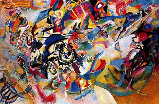 Composition VII by Wassily Kandinsky Credits: Wassily Kandinsky, Public domain, via Wikimedia Commons | Kandinsky thought colours were like music notes. In his painting ‘Composition VII,’ he used lots of vibrant colours and geometric shapes to communicate deep ideas. |
Colour in Digital Art
In this digital age, colour theory goes beyond the canvas. As artists, we now have digital tools at our disposal. We have the advantage of precise colour control. And if you are into digital art (like me), you are probably already familiar with these concepts:
- RGB: This stands for Red, Green, and Blue. These are the three primary colours of light, and by adjusting their intensity, we create colours on screens and digital devices.
- CMYK: This stands for Cyan, Magenta, Yellow, and Key. These are the ink colours used in printing. Knowing how to work with CMYK is essential if you plan to print your digital art.
- Hex Codes: These are like secret codes for colours, often used in web design. For example, #FF5733 is a hex code for a specific shade of orange.
- Colour Pickers: These are tools in digital software that help you choose and adjust colours.
Whether you are designing a logo, creating digital art, or simply having fun with colours, these tools give you precise control over your colour palette.
Colour in Marketing
Colours also play a significant role in marketing and branding. Often, you will notice that companies have specific colour palettes to convey their brand identity and positioning. Think about this: when you see a bright red can, which brand comes to mind first? This association between colour and brand is no coincidence; it is a conscious effort by the brand to create a strong and memorable brand identity.
We encounter this every day in our lives, whether we are taking a bus, shopping, or scrolling through TikTok. Colours are used across all advertising channels. Businesses use colours to stir emotions with the goal of leaving a lasting impression. For instance, blue often represents trust and reliability, a common and popular choice in the banking and financial industry. On the other hand, red and yellow are frequently used in the food and beverage industry to create a sense of urgency and excitement.
As a self-taught artist, understanding the connection between colour theory and branding can be a well of inspiration for your art. It also offers insights into the strategic use of colours in the business world, which can be valuable if you are planning to start your own business.
Make Your Own Colour Wheel
Now, let’s get hands-on with colour theory – by creating our colour wheel. Grab your favourite art supplies, whether it’s crayons, paints, or coloured pencils, and follow these steps:
Step 1: Start by gathering the primary colours: red, blue, and yellow. Colour them in.


These colours form the foundation of your colour wheel. Primary colours are fundamental because they can’t be created by mixing other colours. So, red, blue, and yellow are your fundamental colours.
Step 2: Now, let’s experiment with mixing two primary colours to create the secondary colours. Colour them in.


Step 3: Next, let’s explore the intermediary shades, known as the tertiary colours. These are created by mixing a primary colour with an adjacent secondary colour. Colour them in, and you will complete your outer circle.


Now, move on to the inner circle to understand more about the colour settings:
Hue: This is the pure pigment of the actual colour, without any tint or shade. It is located on the outer circle.

Saturation: This refers to the intensity of the colour. Highly saturated colours are vivid, while desaturated ones are more muted. In the colour wheel, moving left results in a more desaturated colour, while moving right increases saturation.

Value: Value is about the lightness or darkness of a colour, which can be adjusted by adding black or white paint. On the colour wheel, moving up makes the colour lighter, and moving down makes it darker.

Contrast: This is the difference between the darkest and lightest areas in your artwork.

Here is a fun exercise for you:
Create your own colour wheel, starting with the outer circle and gradually adjusting the shades by adding small amounts of white and black.
Colour Harmonies
The next concept in colour theory is colour harmonies, which use geometric relationships to identify harmonious colour combinations. Here are 7 major colour schemes, simplified and summarised for you:

Monochromatic colour schemes involve variations of a single colour. You can play with lightness, darkness, and saturation to create depth within a single colour. It is often used in minimalist design, fashion, and interior decor.

Analogous colour schemes consist of colours that are adjacent to each other on the colour wheel. They create a sense of cohesion and are frequently used in nature-inspired designs and serene compositions.

Complementary colour schemes involve pairs of colours that are opposite each other on the colour wheel. They offer strong contrast and are commonly used in design to make elements stand out, such as in branding and advertisements.

This scheme is a variation of complementary colours, utilizing one base colour and two adjacent colours to its complementary colour. It creates a balanced yet visually appealing effect and is often found in branding, packaging, and web design.

Triadic colour schemes involve using three equidistant colours on the colour wheel. They create dynamic, vibrant compositions. They are suitable for a wide range of designs, from websites to interior decor.

The square colour scheme involves four colours evenly spaced on the colour wheel. It provides rich contrast and is suitable for complex designs and colour patterns, often seen in art and decor.

The rectangle colour scheme employs four colours, with two pairs of complementary colours. It’s versatile and can be used to create visually interesting compositions in graphic design and interior decorating.
Warm and Cool Colours
Finally, we have warm and cool colours.
- Warm colours, found on the top of the colour wheel, include red, orange, and yellow. They evoke feelings of energy and passion.
- Cool colours, located on the bottom of the colour wheel, encompass green, blue, and purple. These colours are calming and serene.
Understanding how to balance warm and cool colours in your art can help you set the desired mood for your creation.

Printable Colour Chart
Here are 2 colour theory cheat sheets you can download to familiarise yourself with the colour wheel.


Remember, colour theory isn’t just for painters. It is a universal language that connects us through the emotions and messages we share. Whether you are a pro artist or someone like me who is learning on your own, understanding colour theory is the key to unleashing your creativity.
This post is all about colour theory for beginners.
If you love to see more content like this, connect & follow me on social media to stay updated with the latest information.
Other posts you may like:
- Perspective Drawing For Beginners: From Novice to Pro
- The Best Art Tools for Young Artists to Get Started
- 7 Basic Shading Techniques for Beginners to Shade Anything


